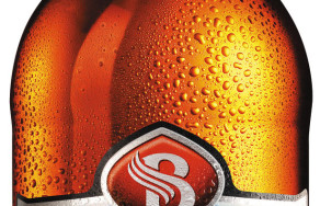
Birell brings a fresh perspective to beer packaging
17.3.2010

Work on the transformation of the Birell image took close to two years and it was divided into two phases. The first change happened in May 2009, when then-named Radegast Birell came out with a new label together with a shorter name, Birell. The second phase is now being finalised.
The project of changing the image and the separation of the Birell brand, which cost tens of millions of Czech crowns, took place in spite of a difficult financial situation during an economic recession. The contract to produce more than 700,000 beer cases actually provided the Alfa Plastik, a.s. company work on two machines during one year.
“Just like the majority of Czech companies, we had to face the impact of an economic recession. That is why we were extremely happy about the contract to produce beer cases for Birell. This contract helped us to be able to keep production in our factories in Tachovo and in Bruntál,” the director of production of AlfaPlastik, Roman Gajdoš, commented on the partnership.
Parts of the new identity, which was designed, just like last time, by a renowned Italian design studio, Lumen, the logo of Birell and the symbol of the brand, a letter B “with wings,” remain unchanged. The overall look of the new beer cases is very unique on the Czech beer market, because in comparison with the majority of usual labels it seems at first sight very dynamic, but premium-like.
The design studio Lumen, together with Birell, worked on this revealed design for seven months. “It seems long, but keeping in mind the importance of the brand and its relationship with its consumers, it was adequate. Everybody's goal was to successfully complete the project to the last little detail,” said the founder and creative director of Lumen, Drew Smith. Lumen works with many important brands; it also created a corporate identity for AC Milan, a soccer team.
A unique design was also given to the current white beer case, which will be exchanged for a blue one with bold graphics, a 3D logo with refreshing-looking drops. The beer case was made in partnership with a London-based company, Radius Design.
“We chose the new design for packaging and beer cases, so that they can be distinguished right away from the competition's packaging, so that Birell consumers can find it easily. From our new packaging and beer cases, we expect more visibility in stores and higher perception of the brand's attractiveness for our consumers,” stated Vladimír Vaněk, brand manager of the Radegast Birell brand.
Customers can see the new Birell on March 17th exclusively on shelves of the Albert chain of stores. Starting in April, the new packaging will then be delivered to other chains and to the whole market.
Contact information for media:
Daniela Velová
Account Director
Native PR, s. r. o.
Ph. no.: (+420) 221 592 450, Fax: (+420) 221 592 451
Email:
www.nativepr.cz
Ing. Vladimír Vaněk
Brand Manager Radegast Birell
Plzeňský Prazdroj, a.s.
Cell phone: (+402) 724 617 827
Email:
www.birell.cz
Prague
